Sunday, 17 March 2013

Week 22 - Quieter Pieces


Whilst making my large banner pieces I have been looking back over the frottages I made earlier, and re-engaging with them in different media. I painted them onto small primed pieces of canvas, so they continue the idea of transformation, from one media to another, resembling frottages, although painted directly:

I have also been looking at collographs where I can combine thinner cut lines, drawing into the card and copying some of the frayed carpet images. On a larger scale they would be akin to Susan McMurray's huge hairnet drawings - enlarging the everyday, the inconsequential:

On a recent trip to New York, I was  inspired to revisit my smaller scale prints after seeing the exhibition of Zarina Hashmi,  at the Guggenheim:  Guggenheim New York, Zarina: paper like skin. Whilst her work has a true engagement with the paper - (in many of her pieces the medium becomes the image itself) - there is also a strong socioplitical meaning behind her work. I found the exhibition very moving, powerful and spiritual.


Zarina Hashmi Dividing Line, 2001. Woodcut printed in black on Indian handmade paper 

Zarina Hashmi--1937-india-a-house-of-many-rooms
Brice Marden's prints share a timeless quality with those of Zarina's and he talks about the importance of drawing. I am attracted to  these modest scale, human sized, intimate prints and drawings. His reuse of the same etching plates to create different permutations and mirror images is something I have been exploring.

Brice Marden (no title) From Ten Days 1971 Etching and Aquatint 

Brice Marden: Untitled from 12 Views for Caroline Tatyana (inspired by Greek architecture)

Vija Celmins' contemplative images show a great depth of space and stillness. She is also very involved in the exploration of process which I have been researching. I am also interested in her reappropriation of photographs and Like Marden, the positioning of her plates on the paper.  
Vija Celmins Web #1 1999 Charcoal on paper
Vija Celmins Concentric Bearings C 1984 Aquatint, drypoint and mezzotint on paper
I looked back over my  work with frottage to find this etching which at the time I rejected because it didn't fit in with the series I was producing.However, having researched Zarina, Marden and Celmins I am continuing with this investigation.  It has the closeness and intimacy that I want to explore,  and retains the embodiment of the hand done. 

Etching and aquatint
Below are some pages of my sketch books, exploring ways to continue with printing:
I have been experimenting with different etching and printing processes to reconnect with my theme of the everyday domestic interior and the transient marks left by its users. My intention is that the prints might allude to atmospheric landscape as well as a lived-in environment.

I produced this etching and aquatint using the same method as the print above:
Below are some more prints I have been working on. I may add titles to these, but for the moment I have noted the etching process only, for the sake of documentation.
Aquatint and etching
Two plate coloured etching using both plates shown above
Photograph of waxed plate where I tried to clean off the wax.  I would like to reproduce this in etching, somehow.

The images shown below are all paper lithography, different plate sizes, but same sized paper,
so they have different amounts of border around them.  I will be working on the amount of image  to transfer, and its positioning within the plate.
taken from frottage of flooing, but the cross gives it religious overtones.
different scales so different amounts of detail show


positive and negative of the same image

Frayed carpet but resembling a skyscraper emerging from the mist, or the 1950's festival of Britain "Skylon"
 I am hoping these images appear to have a new subject emerging , whilst they themselves have been taken from something inconsequential. 

Friday, 8 March 2013

Weeks Nineteen to Twenty one - Still printing large

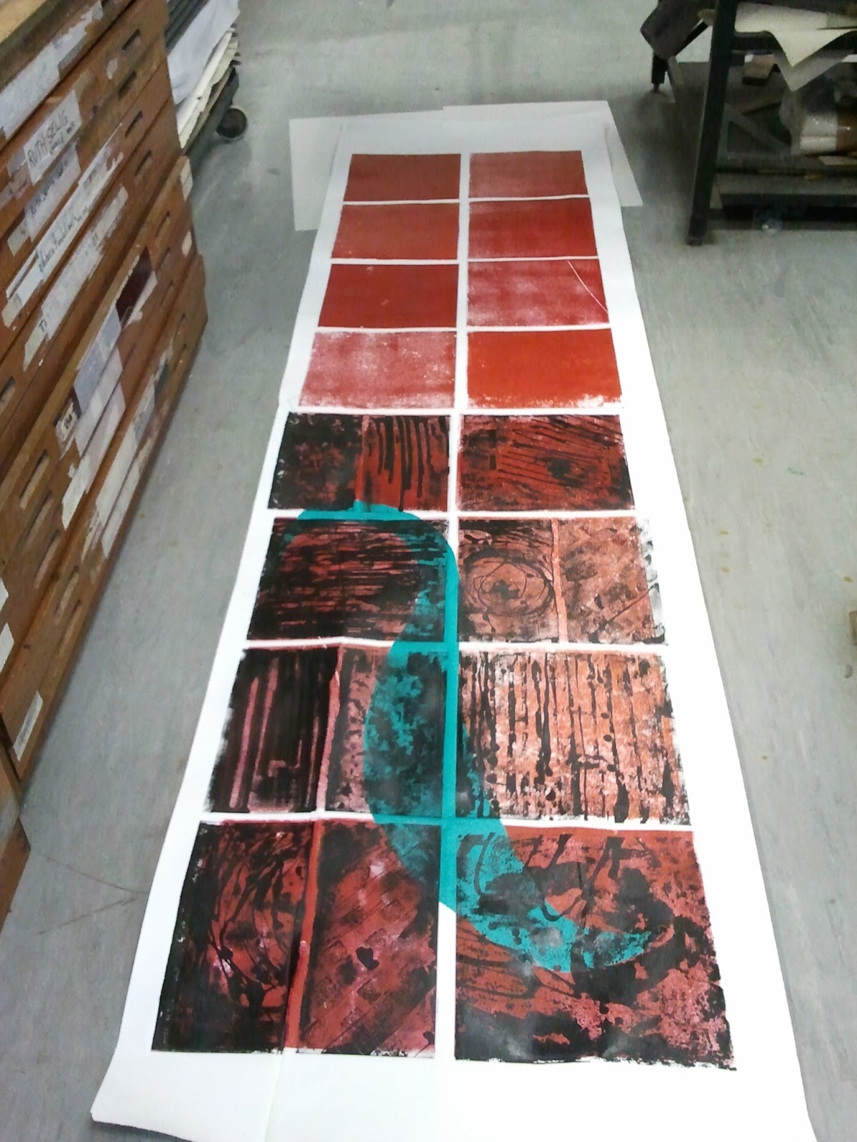
Having mapped out my plan of the large format print, tested the bed pressure, I am now proceeding with this print - twice the size of the printing bed. I hope to experience what happens both technically and artistically when the scale almost gets out of hand. Tearing the roll of paper was a nightmare as it had to be torn in width and length.  My initial plan that I would print the whole of the first layer in one go has been rejected. Instead I have created a registration sheet, printed the first eight base tiles, left them to dry for two days, marked the last tiles on the reverse of the paper, re-positioned and printed the next eight base tiles. The last tiles didn't quite pick up the ink when passed through the press, so I used a barren on these. 


This is almost like a banner, to be viewed from a distance, unlike the close up, intimate viewing of my etchings. When you are up close, you can see that the squares have not received colour evenly, which gives it a handmade printed quality, and the red colour varies slightly across the sheet. It looks like terracotta tiles, rather than the bathroom reference of the colours used previously. I am not comfortable with the fact that the paper, even though dampened, has ruckled and split. If I am to pursue this, there will be a lot of learning to be done to master the technique.

However, on with the second layer of tiles, as my sketches of layout. Again, after the first layer was dry, half the banner was tackled using the same registration sheet, adding chine collee.


The chine collee jumps out too much, and as it crosses the white gaps it caused the paper to ruckle again; the black on red is also too much of a contrast; the gaps between the tiles are wider than on the blue piece so a lot of the white paper is showing through and dividing the tiles up. Not happy but will  continue anyway. 

I decided to cut the banner in half so the second half could be printed with a colour nearer to the base red which wouldn't  jump out so much. I also rejected chine collee. 


These are the four banners hanging in the studio.


To conclude this piece for Andrew Hewish's  "Task 4" (make a piece including at least four media) and coinciding with international women's day, I added a load of smashed bathroom tiles at their base, applied paint with a bathroom sponge to detract from the white space between tiles, added text from the nursery rhyme and "The Scaffolds" 60's song "Monday's washing day, Tuesday's soup...etc" in a circular fashion around the tiles, with a recorded background hum of the fridge. Together with the garish red colour it could be viewed as a breakdown and destruction of the domestic environment, almost out of control, an exasperation with life...

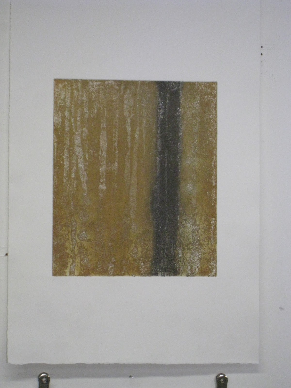
Over the last few weeks in the print room I feel like I am reproducing the work of a tiler or a builder setting out a building in its early stage, and whilst my project has centred around the built environment this is straying too far from what I was investigating.  I do think it was useful to work at a large scale and see that the visual impact is different;  the work is less intimate;  marks are bolder and perhaps the quality of the prints is less important as they are viewed from a distance. But now I want to continue with my quieter pieces, cracks, worn carpet etc


Thursday, 14 February 2013

Week Eighteen - cracks in the lino

I have prepared more lino tiles - same method as previously. I thought the caustic soda wasn't etching so well, possibly due to a different batch of lino, so I left it on for longer. Now I think I should have washed it off and printed test pieces, before reapplying. 

However, I'm trying to find a way of matching my printing method to my theme. I have smashed tiles and printed; now I have torn the lino squares in half. These pieces of broken, cracked lino reference the broken house, cracked and decaying building. When printed together with the rough edges facing each other, the gap or crack between the halves becomes significant. Also, mixing the pieces up means the two halves start to have a dialogue between each other. 
etched lino tiles torn in half

different halves printed together


different halves printed together

 I am mapping out a layout for a large print, using full tiles and half tiles with the lacquered mount boards rolled up in a base colour, and trapping bits of wallpaper, wrapping paper, newspaper etc.. I need a full day in the print room as the paper is so large and there are so many tiles. I feel like a tiler on a construction site, working to plans and calculating materials needed.

Sketches showing various layouts of tiling

The lino blocks are thicker than the base boards so I was going to have to change the pressure of the printing bed to accommodate this. However, this would mean my registration would go - the paper would no longer be trapped for the second layer. I carried out a test piece using the pressure needed for lino. The potential was that there would not be enough pressure for the base block. However, glad to say keeping the pressure constant worked for both thicknesses. I still have to fathom out how to print a sheet which is larger than the bed. 


test tiles using constant pressure on the bed


Saturday, 9 February 2013

Week Seventeen - more etched linos, larger prints


I've taken a hammer to my ceramic and glass tiles, cracking and smashing them to then roll them up in bitumen black and transfer to lino as before. The intention is to match the print making process to my concept of decay and collapse in the built environment, and make further use of those materials. I'm in the process of making more lino tiles also continuing with frottage, and general marks left by wear and tear and human usage in buildings. 
smashed tiling inked up with Bitumen black 

Bitumen black transferred to lino (not yet etched).


I'm preparing two-plated prints, this time using a roll of paper 3 metres long. My plain coloured underlayer is going to be lacquered mount board (3 coats) - cheaper than lino.
preparing the tiles used as coloured underlay


Saturday, 2 February 2013

week sixteen - scale with colour

I've been looking at Susie McMurray at the London Art Fair and her huge drawings of hair nets. I like her reference to women, and how the insignificant becomes the subject of her work. 

I experimented with placing collage on my print, with a view to later using the images as a chine colle, trapping the residuals of family life between the prints of the lino - large scale drawings of  toothbrushes, tissue, wrapping paper etc. 


Following on from my mock up with the collage, I have printed another large scale block print, as a double plate ((12 plates in total). This time with colour, using plain rolled up lino as the background. I've used blue and green to reference "bathroom-type" colours, and again used all the lino that I have previously etched. I've encapsulated bits of paper and tissue bringing another layer to the print; another dimension.


I am hoping that these images, which encompass accidental marks and indeterminacy of the acid etch process, start to allude to atmospheric landscapes and lived-in domestic environments. There seems to be a tension between the flatness of the print and chine colle,  with the alluded depth of some of the images. 

 I am intending to make more lino tiles and print even bigger so that the prints move out of the usual format, becoming almost unmanageable. 

Saturday, 26 January 2013

Week Fifteen - scale

I've used all my etched lino tiles (new and old) to make a print as large as the flat bed printer, on a roll of paper. 
The tiles were all inked up in black, the roll of paper cut to size, sprayed with water, blotted.
This is a huge step for me - a completely different scale and type from the carefully crafted etchings I did last year. The large scale removes the humility of the marks, makes them more significant by increasing the size of the overall print; they become an enlargement of the intimate. And at the same time this increase in size has freed me up in the print making process. Whilst the acid etching has been unpredictable and essentially uncontrollable, there has to be careful control in the printing of this scale.  There is a real engagement of the physical with this process - it reminds me of the actual procedure of building.


print size approx 1000x1500mm

Saturday, 19 January 2013

Week Fourteen - Domestic Materials

I went to Topps Tiles and scavenged around in their skip for materials I could use directly to print from. I want to free up my process, and have it reference my concept. I inked up a sheet of tiles in Bitumen Black and used the wood press to transfer to a lino tile. 

The lino tile also references domestic materials - lino on kitchen floors - and the tile shape is used in domestic spaces - kitchens and bathrooms etc.  

Having transferred the tiles to the lino, I added further marks in Brunswick Black, reminiscent of the bathroom stains left by the toothbrushes shown in the photos last week, and scratches and other markings found on the tiles when examined closely. I used toothbrushes and sponges to make the marks - all domestic implements.  I then etched it using caustic soda and wallpaper paste as before. (Using caustic soda for the acid etch is also a domestic substance, frequently used in my drains which get blocked with teenagers hair.)


Print taken of the etched tile.

Saturday, 12 January 2013

Week Thirteen - Investigating Domestic Space

The new year sees further investigation of the theme of flaws in the domestic space; imprints left by its occupants; ghosts of its users; together with the collapse of the building through time. A journey through the house in space and time, as a metaphor for life, with the acid etching process in printing mirroring the decay of the building. Linking up my documentation of the process with the exploration of architecture, domestic environment and life within a nuclear family. 
I have taken new and revisited old photos of seemingly insignificant markings; some which disappear after the weekly house clean, but show evidence of human activity; some which are flaws in the building materials, or show wear and tear over time. 


Thursday, 20 December 2012

Week Twelve - Christmas Cracker Exhibition

I finished my series of prints and exhibited them in the gallery at Central House. I exhibited ten prints in two rows of five:


This is the blurb I attached:


Variations on two themes:
Bathroom Crack
Kitchen Floor (after the party) 2012
Two plate etchings, and two plate etchings with lino print
The idea of indeterminacy and process are used to create images which include marks that are both present and absent.  Drawing on Jacques Derrida’s philosophy of Hauntology – (the present exists only with respect to the past); the initial painted marks (made on lino) are etched and attacked, then transferred to metal, further etched and then printed.  The resultant image holds the absence of the original; it becomes a memory or a ghost, a negative of a positive.  The two and three plate images become palimpsests, superimposed and layered marks bearing traces of those beneath and setting up a tension between the mark making and its absence with an illusion of depth contrasting flatness.
The unpredictability of the acid attack on different materials, leaves the image to chance and together with the lengthy process taken, goes some way to remove it from aesthetic decision making, as seen in the work of John Cage and Antoni Tapies.  This is further reinforced within the practice of printmaking where there is an importance of craftsmanship and skill, as proposed by Richard Sennett, and through a Zen-like adherence to repetition necessary for skill to be perfected.
This work has developed from rubbings and marks taken from the artist's surroundings, noticing and enlarging on elements that are usually overlooked such as cracks, scratches, dirt and spillages.  These insignificant marks and flaws become significant items, and together it is hoped that the resultant series may give a new description of the environment.


Saturday, 15 December 2012

Week Eleven - Laser Cutting

Whilst continuing with the print making, I have been looking into further transformations and processes and have been preparing images on the computer for laser cutting. I wanted to scan the prints into the computer and get the laser cutter to remove the white parts, layering different images on top of each other as you would a print, but using ply or card or coloured perspex. Inevitably this has been a really lengthy process,scanning into photoshop and manipulating the image, transferring to illustrator, transferring onto the laser cutter programme. I cut on oiled graffiti board first, as a trial and it took 30 minutes to cut. Anything thicker would have taken much longer.


laser cut on oiled graffiti board - approx A2 size


At the moment the images are too jagged as a result of the tolerance level being too high, and simply look like computer generated images. Rachel Whiteread's laser cut on 0.8mm stained ply, which I mentioned previously must have had a lower tolerance, but the image itself is more graphic and simple. Whilst the laser investigation was interesting and continued the theme of transformation, I don't think it fits in to my art work at the moment. It incorporates too much digital manipulation, removed from the hand, tool, material engagement which I have been developing.
Rachel Whiteread, Ringmark 2010