Monday, 3 June 2013

Preparing for the Degree Show

I have spent the last few weeks printing my linos, working out templates on the press so that all plates are positioned in exactly the same place on the paper, with the same borders from one image to the next. I have been making my own frames so that the prints hang surrounded by a stained black frame but are not under glass. I have designed a system so that the prints drape over a steel bar, which is held in place by extremely strong magnets at the back of the frame, rather like a Japanese scroll painting.

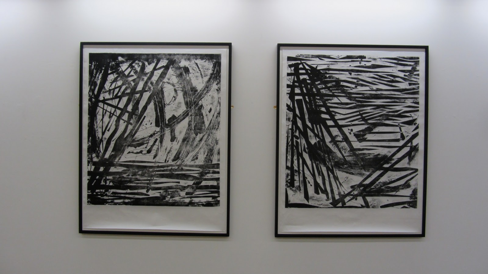
For the Degree Show (on June 13th 2013) my prints have been selected to hang in the main foyer, and I am exhibiting six prints, as three pairs:

Pairs of prints ready to hang. Marking up the press has enabled images and borders to be aligned.

In position


The Ground Floor Foyer

On route to the lifts and stairs

Making the frames: 
Gluing the backing board to the frame
Inked up plate ready to receive the paper. Masking tape used to position lino and paper. Edges taped up to get a white border.


I have titled the prints:
A Linoleum Wilderness
A Sea of Acid
Splintering Wood
A Jetty of Lino
Rivers of Bitumen
Flock
  

Saturday, 27 April 2013

Weeks 24 to 26 - My Floor is My Plate!


Summary of my work so far:
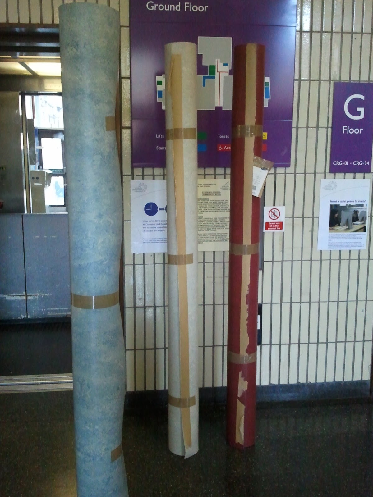
Having taken delivery of a huge quantity of flooring lino, I have revisited my initial etching process started way back last October. This time, the floor itself is my plate - I am not copying images, copying cracks etc. Instead I am directly marking, scratching, taping, wax dripping onto the floor and etching with the same caustic soda and wall paper paste recipe as before.  My domestic theme and dialogue with process have become my prints, using domestic materials to make the plates.

I am using Hosho Japanese paper for the prints, with the lino and paper sized to be the maximum that will fit on the largest flat-bed printer in the workshop. The registration is complex, and calculations are required for sizes so the paper does not get stuck in the rollers. The pressure of the rollers has had to be adjusted to get a balance between intensity of ink and prevention of paper creasing. 

In effect, there is a tension set up between the incompatibilities of materials, pushing them all to their limits. The printer is designed for intaglio, not relief printing, which is why there is a tendency for the paper to crease; the Japanese paper is a rather beautiful expensive rarefied paper made for delicate multi-block wood cuts, yet my plate is a mass produced modern flooring material, as popular now as it was in the 1950's; and I am sloshing liquid Bitumen and caustic soda over the plates, in contrast to the controlled and precise methods used in cutting Japanese wood blocks.

The prints themselves, in black and white, (black ink on white paper), resemble wood cuts, yet the scale and shape of the marks, both the jagged and the gestural, would be impossible to achieve in wood. Hence there is a curiosity about their making. There is a reference to 1950's abstract expressionists, such as Franz Kline and Hans Hartung and indeed Kline’s use of scaling up sections of drawings has been used in some of the prints.  (See the sketch book page of thumbnail images of the kitchen). They also echo the imagery used in Russian Constructivist architecture (Tatlin’s Tower – Monument to the Third International) and Constructivist agitprop art with their forceful diagonal lines. By using a roll of paper, they reference banners, newspaper printing, mass media, multiple copies, whilst interrogating the genre and technology of the printmaking medium.

The images are made as a series of diptychs, working quickly on two images at once, so there is both a sense of dynamism and a narrative between the pairs. As a series they become filmic, alluding to landscapes or views seen from within or from outside; trapped in a cage or looking into the enclosure. The use of jagged cut tape together with layers of stamped on circular shapes or gestural brush strokes, once etched obscure each other, with glimpses of marks emerging ghost like from behind others and the overall prints being palimpsestic.

The black and white evokes light and shadow and the Japanese theme is continued with a reference to the writing of the Japanese author Tanizaki's "In Praise of Shadows" and his descriptions of the importance of light and shadow in Japanese architecture. 

The large scale of these images has meant I have had to move to a different form and scale of mark making. No longer are they made up of small tiled squares of lino, yet they still have an intimacy about them. The indeterminacy of acid etching results in images that can be examined close up, yet they retain a boldness when viewed from a distance. The deeply etched lino itself becomes a sculpture,  both when flat and when rolled, transformed from its origins and providing a further meaning of the work; a multivalency.

So, I am now working on perfecting the printing process, deciding on whether to have thick black marks from the press, or softer marks using less pressure, or even using hand burnishing with a barren, so they have more of a wood cut quality. To achieve the darker prints, I am changing to oil based ink with varying amounts of extender and drying retarder to prevent the plates drying out before I have finished inking them. I have made six plates, each 950mm wide (the paper width) by approximately 1 metre long (and may make more).

My work this year started with an investigation into craft, process and transformation, together with its documentation and combined with studies of the everyday, building, the domestic environment and areas usually overlooked or, (in my work as an architect) covered up. This involvement with domestic architecture and process have become my prints, the domestic materials my plates, and now on a larger scale than previously, they almost become part of the built environment themselves.


Below are a series of photos documenting the making of these prints:


Sunday, 24 March 2013

Week 23 - More small works

Following on from last week I've been experimenting with ideas as to where to go next. 
I've been representing the Bathroom Crack in etching, together with the mess there. 
Zarina Hashemi's prints of the crack represent the political dividing line between India and Pakistan; Doris Salcedo's crack at the Tate Modern Turbine hall represented segregation and racial hatred. My etching of a crack represents purely and simply a crack. It was made by tearing paper in two and tracing the torn edges of each half, open biting to deeply indent the crack, then aquatinted it to darken it and make it more prominent. In a way this construction is a bit like the construction of Salcedo's crack, hers of course on a larger scale. The "splodge" mark to one side was made by pouring acid resist onto the plate, much like you might pour or spill toiletries onto the bathroom shelf.

I also tore up some flooring lino, inked it up and printed it directly - again to be the crack: 
However, I'm abandoning the etching - it doesn't have the impact or interest to be sustaining - it's too derivative. The lino was a quick experiment.

I also looked at the frayed carpet and produced a series of photos showing it's decay and journey, linking it with a description of decay in the domestic environment, through it's occupation. Here are pages of my sketch book, with calculations to achieve step-dimension photographs, stacked up like a staircase, surrounded by text:
It could be an installation of photographs instead of the rubbings shown previously. It references the documentation of Sophie Calle, and links in with my reading of "The Everyday" edited by Stephen Johnstone, celebrating and noticing the everyday.

Sunday, 17 March 2013

Week 22 - Quieter Pieces


Whilst making my large banner pieces I have been looking back over the frottages I made earlier, and re-engaging with them in different media. I painted them onto small primed pieces of canvas, so they continue the idea of transformation, from one media to another, resembling frottages, although painted directly:

I have also been looking at collographs where I can combine thinner cut lines, drawing into the card and copying some of the frayed carpet images. On a larger scale they would be akin to Susan McMurray's huge hairnet drawings - enlarging the everyday, the inconsequential:

On a recent trip to New York, I was  inspired to revisit my smaller scale prints after seeing the exhibition of Zarina Hashmi,  at the Guggenheim:  Guggenheim New York, Zarina: paper like skin. Whilst her work has a true engagement with the paper - (in many of her pieces the medium becomes the image itself) - there is also a strong socioplitical meaning behind her work. I found the exhibition very moving, powerful and spiritual.


Zarina Hashmi Dividing Line, 2001. Woodcut printed in black on Indian handmade paper 

Zarina Hashmi--1937-india-a-house-of-many-rooms
Brice Marden's prints share a timeless quality with those of Zarina's and he talks about the importance of drawing. I am attracted to  these modest scale, human sized, intimate prints and drawings. His reuse of the same etching plates to create different permutations and mirror images is something I have been exploring.

Brice Marden (no title) From Ten Days 1971 Etching and Aquatint 

Brice Marden: Untitled from 12 Views for Caroline Tatyana (inspired by Greek architecture)

Vija Celmins' contemplative images show a great depth of space and stillness. She is also very involved in the exploration of process which I have been researching. I am also interested in her reappropriation of photographs and Like Marden, the positioning of her plates on the paper.  
Vija Celmins Web #1 1999 Charcoal on paper
Vija Celmins Concentric Bearings C 1984 Aquatint, drypoint and mezzotint on paper
I looked back over my  work with frottage to find this etching which at the time I rejected because it didn't fit in with the series I was producing.However, having researched Zarina, Marden and Celmins I am continuing with this investigation.  It has the closeness and intimacy that I want to explore,  and retains the embodiment of the hand done. 

Etching and aquatint
Below are some pages of my sketch books, exploring ways to continue with printing:
I have been experimenting with different etching and printing processes to reconnect with my theme of the everyday domestic interior and the transient marks left by its users. My intention is that the prints might allude to atmospheric landscape as well as a lived-in environment.

I produced this etching and aquatint using the same method as the print above:
Below are some more prints I have been working on. I may add titles to these, but for the moment I have noted the etching process only, for the sake of documentation.
Aquatint and etching
Two plate coloured etching using both plates shown above
Photograph of waxed plate where I tried to clean off the wax.  I would like to reproduce this in etching, somehow.

The images shown below are all paper lithography, different plate sizes, but same sized paper,
so they have different amounts of border around them.  I will be working on the amount of image  to transfer, and its positioning within the plate.
taken from frottage of flooing, but the cross gives it religious overtones.
different scales so different amounts of detail show


positive and negative of the same image

Frayed carpet but resembling a skyscraper emerging from the mist, or the 1950's festival of Britain "Skylon"
 I am hoping these images appear to have a new subject emerging , whilst they themselves have been taken from something inconsequential.