Thursday 20 December 2012

Week Twelve - Christmas Cracker Exhibition

I finished my series of prints and exhibited them in the gallery at Central House. I exhibited ten prints in two rows of five:


This is the blurb I attached:


Variations on two themes:
Bathroom Crack
Kitchen Floor (after the party) 2012
Two plate etchings, and two plate etchings with lino print
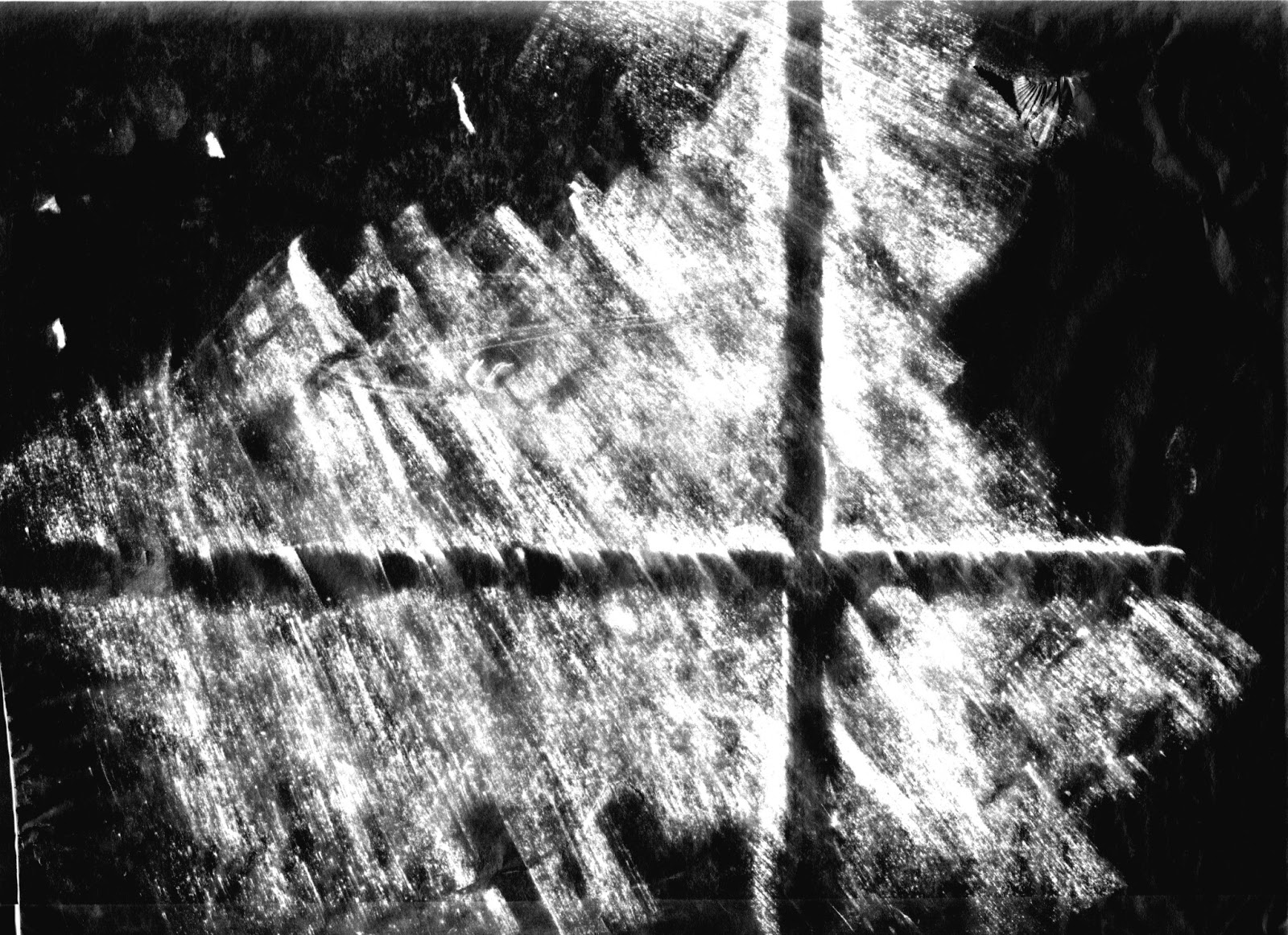
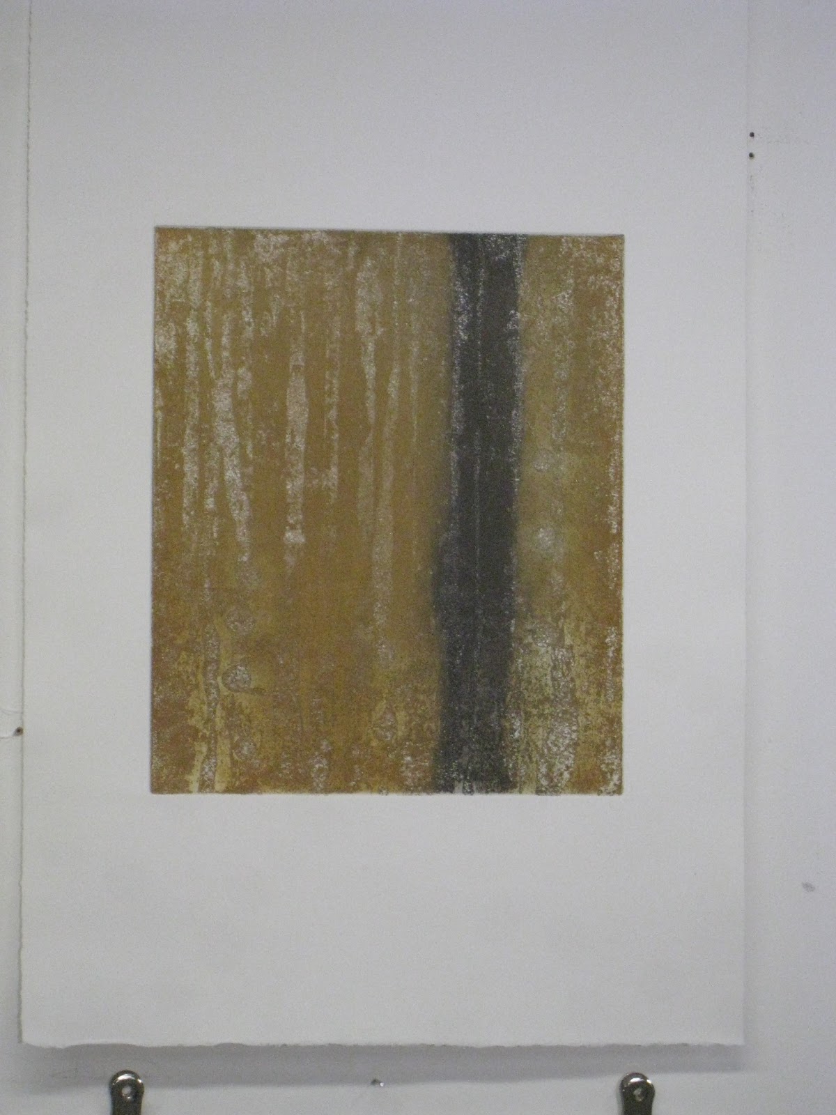
The idea of indeterminacy and process are used to create images which include marks that are both present and absent.  Drawing on Jacques Derrida’s philosophy of Hauntology – (the present exists only with respect to the past); the initial painted marks (made on lino) are etched and attacked, then transferred to metal, further etched and then printed.  The resultant image holds the absence of the original; it becomes a memory or a ghost, a negative of a positive.  The two and three plate images become palimpsests, superimposed and layered marks bearing traces of those beneath and setting up a tension between the mark making and its absence with an illusion of depth contrasting flatness.
The unpredictability of the acid attack on different materials, leaves the image to chance and together with the lengthy process taken, goes some way to remove it from aesthetic decision making, as seen in the work of John Cage and Antoni Tapies.  This is further reinforced within the practice of printmaking where there is an importance of craftsmanship and skill, as proposed by Richard Sennett, and through a Zen-like adherence to repetition necessary for skill to be perfected.
This work has developed from rubbings and marks taken from the artist's surroundings, noticing and enlarging on elements that are usually overlooked such as cracks, scratches, dirt and spillages.  These insignificant marks and flaws become significant items, and together it is hoped that the resultant series may give a new description of the environment.


Saturday 15 December 2012

Week Eleven - Laser Cutting

Whilst continuing with the print making, I have been looking into further transformations and processes and have been preparing images on the computer for laser cutting. I wanted to scan the prints into the computer and get the laser cutter to remove the white parts, layering different images on top of each other as you would a print, but using ply or card or coloured perspex. Inevitably this has been a really lengthy process,scanning into photoshop and manipulating the image, transferring to illustrator, transferring onto the laser cutter programme. I cut on oiled graffiti board first, as a trial and it took 30 minutes to cut. Anything thicker would have taken much longer.


laser cut on oiled graffiti board - approx A2 size


At the moment the images are too jagged as a result of the tolerance level being too high, and simply look like computer generated images. Rachel Whiteread's laser cut on 0.8mm stained ply, which I mentioned previously must have had a lower tolerance, but the image itself is more graphic and simple. Whilst the laser investigation was interesting and continued the theme of transformation, I don't think it fits in to my art work at the moment. It incorporates too much digital manipulation, removed from the hand, tool, material engagement which I have been developing.
Rachel Whiteread, Ringmark 2010


Saturday 8 December 2012

Week Ten - Making a Series

We have the Cass Christmas Cracker exhibition shortly and my aim is to make a series of at least six images to exhibit. By producing a series, or suite, I am hoping to explore and develop a language and understand where to go next, more than if I produce one offs, (hence the reason I set aside the photocopy transfers for the time being).

I've been looking at John Hoyland's series of etchings and the impact that each print has on each other, when viewed as a series. There is a tremendous depth of colour due to the aquatint and carborundum. Each image size is about 700x550mm (the paper size obviously even bigger).  We were lucky enough to view some of these at Nigel Oxleys studio in Bexhill:
Splay 1979


Anking 1979
Memphis 1980

Rankin 1979


Dido 1979
I mentioned before the Howard Hogkin prints I saw at Alan Cristea - again a series with repetition of the same etching in different colours. Each print becomes a memory of its predecessor in the suite. I've also been looking at John Cage with his series of prints inspired by the Ryoanji Garden in Kyoto where he drew around 15 stones whose positions on the plate or paper were determined by chance. 


River Rocks and Smoke: 
4-11-90 #1, 1990

So I am revisiting my prints with etching and lino combined, to include my "Bathroom Crack" images and make a series. I have taken two plate etchings and added the lino "stamp" which had informed the etching and had been the offset onto to the etching. These continue the theme I was working on previously:
2 plate bathroom crack with lino stamp


2 plate bathroom crack, kitchen floor with lino stamp


Saturday 1 December 2012

Week Nine - Bathroom Crack

I want to continue investigating my environment, linking my professional background as an architect, and my personal life within a nuclear family so that the theme of my work is centred around my domestic space, with a narrative about the inevitable timeline of decay. Using the collapse of a building through time and use; worn out carpet, cracks in walls, disorder in the bathroom and kitchen, the work could become a metaphor for life, ageing and relationships in a shared space.  

I was interested in Rachel Whiteread's laser cut ply inspired by glasses and bottle marks left on a table, which gave me the confidence to paint the essence of the Frottage on lino, rather than reproduce it exactly, as I had done on the metal plate previously. I want to continue to investigate and develop the technical side of the process I have devised,  to see where it leads to, but also  I want to combine the ideas of process and manual labour  - direct mark making from direct use of tools - pouring, scraping, mimicking yet transforming textures and  marks from the rubbings. It is this engagement with the specificity of the material which becomes the link between architecture as the theme of the work, and process - in both there is  relationship between person, tools and real material. 

I'm using my rubbings of the bathroom crack - here is the photo of it:
The frottage repeated the crack ie several rubbings of it side by side with the bathroom door lock added:
In a way the "essence" of the crack was transferred to two lino block using Brunswick Black poured and scraped and dripped through stencils. The stencil almost behaved like a crack through which the Brunswick Black could seep. One of the floor rubbings was also "mimicked".
The blocks were allowed to dry as before, then etched with caustic soda (this time 2 tbsp wall paper flakes per 200ml water. 1.5 tbsp caustic soda. Left for 30 mins.)
Bathroom Crack: Brunswick Black applied through stencils

Hall Floor about to be caustic soda etched

Hall Floor Further with etched block
Below is the printed lino block of the hall floor. Experience of the process has told me that the resultant ink was not as thick as in previous lino blocks and therefore would not transfer to the metal plate. There would not be enough density of ink to be acid resist, so would not produce a printable plate. I decided not to pursue the etching onto metal of this block, although I may well use it elsewhere.
The following two lino blocks were variations of "Bathroom Crack" which were printed onto paper and offset onto the prepared zinc plate, as previously described. These were then aquatinted, etched and printed. I would have preferred there to be more ink to resist the acid, with less white grinning through, but I decided to go with them anyway. 
Lino block print of "bathroom crack"

second Lino block print of "bathroom crack"
etching
etching

Shown above are the prints from each of the metal etched plates - as before they are the reverse of the lino prints. Continuing the process from previously I combined these images into two plate etchings and also experimented with colour. Because the lino-to-metal process results in positive marks forming  negative marks, less black on the lino print transfers to less white or negative areas on the metal etched print. My combination etched prints rely on white areas -  paper showing through - to create layering and overlapping.  To enhance the effect, I worked on some of the plates by burnishing to create more negative areas, and also used plate extender to reduce colour intensity:
corner study of bathroom crack with burnishing and more wiping

The resultant marks are more restrained and constrained than the previous etchings and were developed from single images made on a single lino plate, whereas previously the original lino image went over four blocks and I used a portion of that image. They can all form part of a series of prints, exploring different starting points to make different marks and different combinations of plates.


single plate two colours

Two plate, each in a different colour

single plate, multi coloured

Saturday 24 November 2012

Week eight - insignificant things

Following on from Ian Breakwell and Simon Pope, I am aware of how unaware we are of our surroundings. For example, some time ago I tried to draw from memory, my walk to university, but only drawing above the ground floor of the buildings I passed. This very difficult exercise highlighted how we never notice upper storeys of buildings, rarely looking above or below our eye-level and generally how unobservant we are. I am trying to incorporate aspects of the built environment in my work; linking my printmaking with my work as an architect.  It has lead me to research artists who use or record elements of the environment in their work.

I've looked at the prints of Tom Phillips who on his journey to work photographed every stop cock he passed in the pavement, and on the way home photographed those on the other side of the street.  He transferred these to form a large etching - Canto XXXII, 1983, which documents a specific observation on his journey in pictorial form, recording elements which would normally be of little significance.


Continuing my thoughts on highlighting the unremarkable,  I'm investigating accidents and interruptions, for example imperfections in building materials that are not usually noticed. Performing charcoal rubbings of surfaces brings up scratches and indentations that are usually overlooked and contrast with architectural precision  required in building.  By examining say floors, walls, ceilings of my house and outside, I could build up a new language of the environment, removed from the usual plans, sections, elevations - a record of what you would not usually describe. 

Shown below are the "Frottages" carried out with charcoal on a roll of specialist architectural detail paper (the medium itself being significant). Not only are imperfections shown up, but also the direction and speed of the work has an influence on the images.


These rubbings were scanned and printed, and some were reversed in photoshop:


Max Ernst is the obvious artist to reference for rubbings or "Frottage", but also the Boyle Family use architectural materials in their work. However, The Boyle Family use casts of actual materials they are describing, whereas mine are transformed onto paper, by rubbing and then manipulated in photoshop and also transformed by the etching process. The transformation through several processes continues my work on process itself.  These images not only enhance the imperfections described before, but also continue the "ghost" theme; they describe something which is no longer there; a memory.

I took one of the reversed images of a rubbing of the hall floor, and used the photocopy etching method described in week 2 to transfer the image onto a metal plate (ie: soak the photocopy image for a couple of minutes; place on worktop and dab on oil based ink, mixed with plate oil. Run through the press onto a degreased etching plate. Place in the aquatint box. Use the ink as acid resist and etch for 30 seconds - any longer and the ink would have been bitten away.)

I produced two prints, the first in black, and the second in yellow and black, blended at the edges giving a burnt out look. 


This process has resulted in images which are more haunting than before, floating, bearing only traces or memories of the original substance from which they were taken from. 

They are reminiscent of Rachel Whiteread's "Study for (Blue) Floor" - partly because of the subject matter (floor) and the diagonal in the composition, but also because she draws only part of the floor, which emerges from the background. She has hand drawn and painted this work onto graph paper - (again a medium used by architects; mine originated as a drawing  on architectural detail paper) - and it is this freely drawn nature that contrasts with the precision of the paper.