Saturday, 24 November 2012

Week eight - insignificant things

Following on from Ian Breakwell and Simon Pope, I am aware of how unaware we are of our surroundings. For example, some time ago I tried to draw from memory, my walk to university, but only drawing above the ground floor of the buildings I passed. This very difficult exercise highlighted how we never notice upper storeys of buildings, rarely looking above or below our eye-level and generally how unobservant we are. I am trying to incorporate aspects of the built environment in my work; linking my printmaking with my work as an architect.  It has lead me to research artists who use or record elements of the environment in their work.

I've looked at the prints of Tom Phillips who on his journey to work photographed every stop cock he passed in the pavement, and on the way home photographed those on the other side of the street.  He transferred these to form a large etching - Canto XXXII, 1983, which documents a specific observation on his journey in pictorial form, recording elements which would normally be of little significance.


Continuing my thoughts on highlighting the unremarkable,  I'm investigating accidents and interruptions, for example imperfections in building materials that are not usually noticed. Performing charcoal rubbings of surfaces brings up scratches and indentations that are usually overlooked and contrast with architectural precision  required in building.  By examining say floors, walls, ceilings of my house and outside, I could build up a new language of the environment, removed from the usual plans, sections, elevations - a record of what you would not usually describe. 

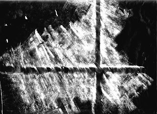
Shown below are the "Frottages" carried out with charcoal on a roll of specialist architectural detail paper (the medium itself being significant). Not only are imperfections shown up, but also the direction and speed of the work has an influence on the images.


These rubbings were scanned and printed, and some were reversed in photoshop:


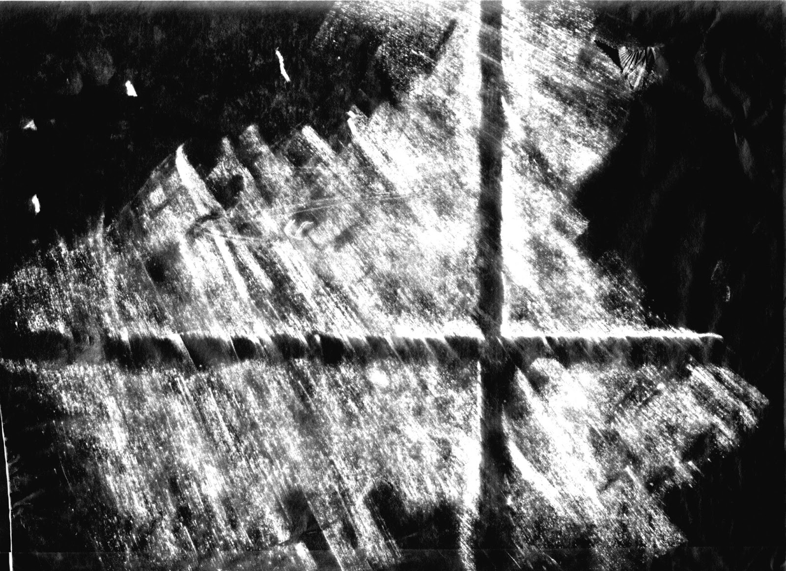
Max Ernst is the obvious artist to reference for rubbings or "Frottage", but also the Boyle Family use architectural materials in their work. However, The Boyle Family use casts of actual materials they are describing, whereas mine are transformed onto paper, by rubbing and then manipulated in photoshop and also transformed by the etching process. The transformation through several processes continues my work on process itself.  These images not only enhance the imperfections described before, but also continue the "ghost" theme; they describe something which is no longer there; a memory.

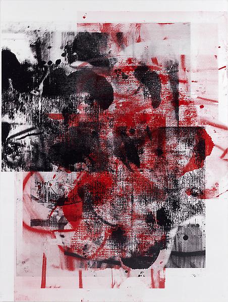
I took one of the reversed images of a rubbing of the hall floor, and used the photocopy etching method described in week 2 to transfer the image onto a metal plate (ie: soak the photocopy image for a couple of minutes; place on worktop and dab on oil based ink, mixed with plate oil. Run through the press onto a degreased etching plate. Place in the aquatint box. Use the ink as acid resist and etch for 30 seconds - any longer and the ink would have been bitten away.)

I produced two prints, the first in black, and the second in yellow and black, blended at the edges giving a burnt out look. 


This process has resulted in images which are more haunting than before, floating, bearing only traces or memories of the original substance from which they were taken from. 

They are reminiscent of Rachel Whiteread's "Study for (Blue) Floor" - partly because of the subject matter (floor) and the diagonal in the composition, but also because she draws only part of the floor, which emerges from the background. She has hand drawn and painted this work onto graph paper - (again a medium used by architects; mine originated as a drawing  on architectural detail paper) - and it is this freely drawn nature that contrasts with the precision of the paper. 


Saturday, 17 November 2012

Week Seven De La Warr Pavilion, Ian Breakwell


Third year print makers went on a trip to Bexhill to meet up with tutor Nigel Oxley and visit Ian Breakwell's  exhibition  "Keep Things as They Are"at the De La Warr Pavilion.  I've been to the De La Warr many times and love this modernist icon. One of the highlights of the exhibition was the double video installation "The Other Side" which uses the staircase and balcony of the Pavilion as a backdrop to elderly couples waltzing to Shubert's "Nocturne in E Major", with the distant sound of the waves crashing in time to the pendulum swing of the camera as it pans to and fro across the balcony. It is a mesmerizing and moving piece about ageing, death and loss, filming ordinary people, performing a romantic dance at the end of their lives.

Breakwell's theme of the ordinary continues with his photographic diaries, recording seemingly arbitrary and unimportant events, unlike usual diaries. His "Walking Man" photographs the same man everyday,  viewed from his 3rd floor Spitalfields room, until the man disappears and is no longer seen walking the streets daily. 

I am drawn to Breakwell's idea that someone of no significance is given significance and meaning; that he observes things we take for granted and highlights them.  

Later in the week artist Simon Pope gave a lecture at The Cass, where he described walking as a contemporary art practice.  Pope is inviting people to engage, observe and understand the space around them. I think there is a link between Pope and Breakwell in their desire to imbue that which we take for granted with significance -  a theme which I find very interesting - and which relates to my own work.

Saturday, 10 November 2012

week six - more lino and etching


Investigating combining lino print with etching so the image plus its "ghost" and "negative" appear on the same sheet. For example, the black double loops at the left side are ghosted in the etching, top right of the image.


The technique for this involved printing the lino onto tissue in the wood press, then offsetting that print onto dampened Somerset paper, in the etching press. Leaving the paper caught between the rollers, a further two etching plates were printed one after the other, to get a combined offset lino with two plate coloured etching.

The lino part of the image bleeds off the two edges of the paper (although here appears more faded than it is), whilst the etching part is more conventionally positioned within a white border or "window".

I came across this Christopher Wool's print after I had done my prints shown above. I could add more lino images to my etchings.  However, before I saw Wool's print,  I had already decided to remove the square edges of the lino image, to remove the "window" from that part.
Christopher Wool, Untitled, Silkscreen 2009
www.luhringaustine.com

Using the same technique all over again, but this time cutting up the tissue of the offset lino:
choosing the piece of lino image

Choosing the piece of lino image - sitting on the cutting board - in itself an image I could explore....

Printing the lino, cutting the tissue, offsetting, double etch coloured print.....each print took a staggering two hours to print! A lengthy process!


Blue/black offset lino on two plate etching
Red offset lino on two plate etching
These prints contrast the lino image bled from the paper edge with the etching image more constrained in the picture window, hopefully setting up a tension. The contrasting colour of the lino image works best but needs to be printed over the etchings to stand out more. (Not sure what will happen to it printed over plate embossing, which at the moment I've managed to avoid).

All these prints obviously look different (and hopefully better) when viewed in the flesh rather than by camera phone. You can see the subtleties of layering of shapes and colours, which don't come out so well on photographs. 

So, further work on these plates would be: 
1. small section of lino printed last over etched plates
2. more lino images printed on etchings, looking at Wool's prints, either as the whole square lino plate or as sections.

And after that.....where next? Pushing the random marks further? Using photographic images and seeing what acid does to them? Bringing back a theme together with process? (Architecture would be good...linking my profession).

Friday, 2 November 2012

week five - the ghost of the lino

Following Rosemarie McGoldrick's comment on my post, I'm looking at the concept of Hauntology.  Initially I found a book blog in the guardian on line (www.guardian.co.uk/books/booksblog/2011/jun17/hauntology) which has pointed to many contemporary writers to investigate. (more of this later)

The idea of loss, absence, ghosts, also ties in with my research of Christopher Wool. Not only do his paintings incorporate the idea of mark making and rubbing out, adding and removal, addition and loss, but also he has been associated with "Process Art"  and an interest in abstract art and the process of painting.


Christopher Wool, Untitled 2003

Christopher Wool Tree Women (Light) 2005

I'm looking at a way of using the lino blocks to form etching plates, so the final prints record an absence of the original material; that is the etchings become the negative of the lino. The idea of repetition previously discussed will also be developed, with variations from one print to the other as well.

So, I am finding a way of transferring my lino block images to an etching plate. (The linos were themselves eaten away by acid - and so too will the etching plates be.)

The process:
Using the principle that oil based ink is acid resist, I relief inked a lino block, printed it onto butter paper in the wood press, used the butter paper image (still wet) and transferred it to a zinc plate via the etching press.
lino image transferred to metal
The metal plate, now with the oil based ink on it, was aquatinted, and placed in acid. So the positive lino image (now in red ink) remains untouched by the acid and therefore when intaglio printed will become a negative image.

I repeated the process with another lino plate, to get two etching plates. These were printed separately and together. I used different colours, printed them in different orders and printed them different ways up. 


These plates were printed over each other producing a layering of images and marks, ghost images of each other and negative images of the original lino plates.

plate on right,shown above, printed over brown plate on left
 plate on left shown above, printed over brown plate on  right


black on blue
Looking at Christopher Wool again, where are his marks from? Also, there is a similarity of colours in the layers of his silk screen. I'm interested in the idea of creating abstract shapes - removal of myself from the image or resultant marks, and the process I've adopted (lino through to etching) certainly creates an uncertainty of marks.
Christopher Wool Untitled 2007, silk screen


Wednesday, 31 October 2012

Week four - repetiton

 36 photographs and 12 diagrams
Mel Bochner at the Whitechapel Art Gallery - I find his reworking of his older pieces more interesting than his word paintings. 36 photographs and 12 diagrams photographs little wooden blocks in plan elevation and isometric, together with a corresponding diagram for each arrangement. It is a series of images,exploring repetition,  which when viewed together enable us to reconstruct the original sculpture. 

Four Smears: 1968/2010

Four smears is a process of photographing photographs, displayed in pairs of positive and negative, both in form and colour. "Photography is shown to be a process which self-produces new images rather than one which records exiting objects in from of the camera..." (Whitechapel blurb on Four Smears: 1968/2010)


Surface Dis/Tension (Recursive)
Also, Surface Dis/Tension (Recursive) 2012, where Bochner has rephotographed a wet and crumpled print investigating perspective, and hung it out to dry. He has printed it as both positive and negative again. The images have been laid on top of each other, but slightly out of kilter. 

I'm interested in his use of repetition and photography. Pushing the large lino pieces a little further, I decided to reprint them, on top of each other, but waiting for each layer to dry. Printed the first block four times to get four multiple coloured prints.


first block inked up in yellow
all four prints, first layer, in drying rack
second layer added 
I don't think the first layer was dry enough  as some of the yellow bled through. What a lengthy process!  All prints were numbered so the same order would be carried out each time. Note: registration method crucial here. (Last week's print wasn't registered properly - in particular because the lino ins't cut square). Paper was blotted between two sheets of damp tissue - tried without damping but result was no good.


third colour added
fourth/final colour
fourth/final colour with more extender


Thursday, 18 October 2012

Week three part two - scale


Email correspondence with Steve Edwards - decided to change the stop out I was using to Brunswick Black. Having seen Howard Hodgkin's huge etchings at Alan Cristea's gallery over the summer, and after a conversation with Dolly Thompsett, I decided to try larger sheets of lino, to work with Brunswick Black and to remove myself from the object I was using.

These Howard Hodgkin etchings are of a vast scale - so striking. They are part of a series so the same plates are inked in different colours, often with a coloured wash added afterwards. Each print is made up of 2 to 4 sheets of paper - they must have been printed on a huge press.

I took on board Dolly's suggestion of upping the scale and used four blocks of lino butted together, each 300mm square. I dripped, sponged, scratched the Brunswick Black, added parcel tape, cracked the lino and left it to dry overnight.
4 lino plates butted up together, painted with stop out
two of the plates printed, on the drying rack
New caustic soda recipe: 200ml water, One and a half tbsp wall paper, 2 tbsp caustic soda. (Steve uses 3tbsp caustic soda). I left the sheets for 30 mins. The stop out more or less held - except the sponged areas. The parcel tape worked really well. But the lino became very bowed so didn't ink up well or run through the wood press evenly. But overall the image worked.
I inked up the four plates with relief method, using water based ink. I didn't want to remove the stop out as it contributed to the marks.
I reassembled the four prints to make one large one.

The process of working large, cutting up to small then reassembling, reminds me of the reading Andrew Hewish gave us: The Cut-Up Method of Brion Gysin by William S. Burroughs; cutting up and rearranging newspaper articles. So I also printed the four plates on top of each other - a further rearrangement of the images.
plates printed on top of each other, wet on wet

Monday, 15 October 2012

Week Three part one - printing

Printed the three lino plates - used relief method and intaglio method. Also combined relief and intaglio on one plate: intaglio first then carefully rolled ink over the top.
Finally printed all three plates ontop of each other, setting up a registration sheet first to make sure they aligned. Too much white showed through so the plates were printed again but first using a blank plate rolled in yellow. (Yellow blank plate, then raw umber mixed with yellow, dark raw umber, black).  Used less extender for successive plates.

relief total plate with acid

relief - 20min staged acid
relief - stop out
Paper was dampened by a spray and placed in the blotters.
Initially used the etching press but the lino slipped and the images were not sharp. Moved on to the wood press which was better.
intaglio on total plate with acid
intaglio on stop out image
intaglio on 20 min staged acid

relief - 3 plates, first plate blank
This three plate image works best for me - the tool is there, just about, like a ghost arising from the mist. It's a memory of the tool, as printmaking could be seen as a memory of the original image - whatever it was.

The other image which I'd like to work on is the 3rd intaglio plate, where a small square remains in the middle. (Plate achieved by etching over the whole thing in one go.) The material and the process start to make the final image.

Danny Rolph said I should look at ghost storis - M.R. James, and artists such as George Raoult- The Judges - apparitions. Also Frottage and Max Ernst, looking at the technicality of their work where the character of the surfaces shows through. I'm keen on Max Ernst's "Grattage" - where the canvas was placed over a texture and paint scraped over it. Chance happenings. I will pursue that in print.